

About Client
OverDrive - Libby app
It is a company that distributes digital content, through its apps associated with libraries around the world. It was founded in 1986 by its CEO Steve Potash and started digitizing law books to distribute ebooks on floppy diskettes.
The product’s brand value is providing people with access to digital content that is educational, informative, and entertaining.
Libby allows you to borrow digital content such as ebooks, audiobooks, magazines, etc.. from your local library using your library card. It is the only library platform that works with Kindle devices, being able to read borrowed books in the Kindle e-readers.Their customers are libraries and library users.
One direct competitor is Hoopla and the indirect competitor is Amazon.
Project Summary
The design project is about the rebranding of the mobile app Libby based on their existing design, to make the app more visually appealing and improve the overall experience of the user. The project should be completed by July 21. The product is advertised by social media and app platforms. The libraries’ users will use the new design while using the Libby app to borrow, read, or listen to books.
Target Audience
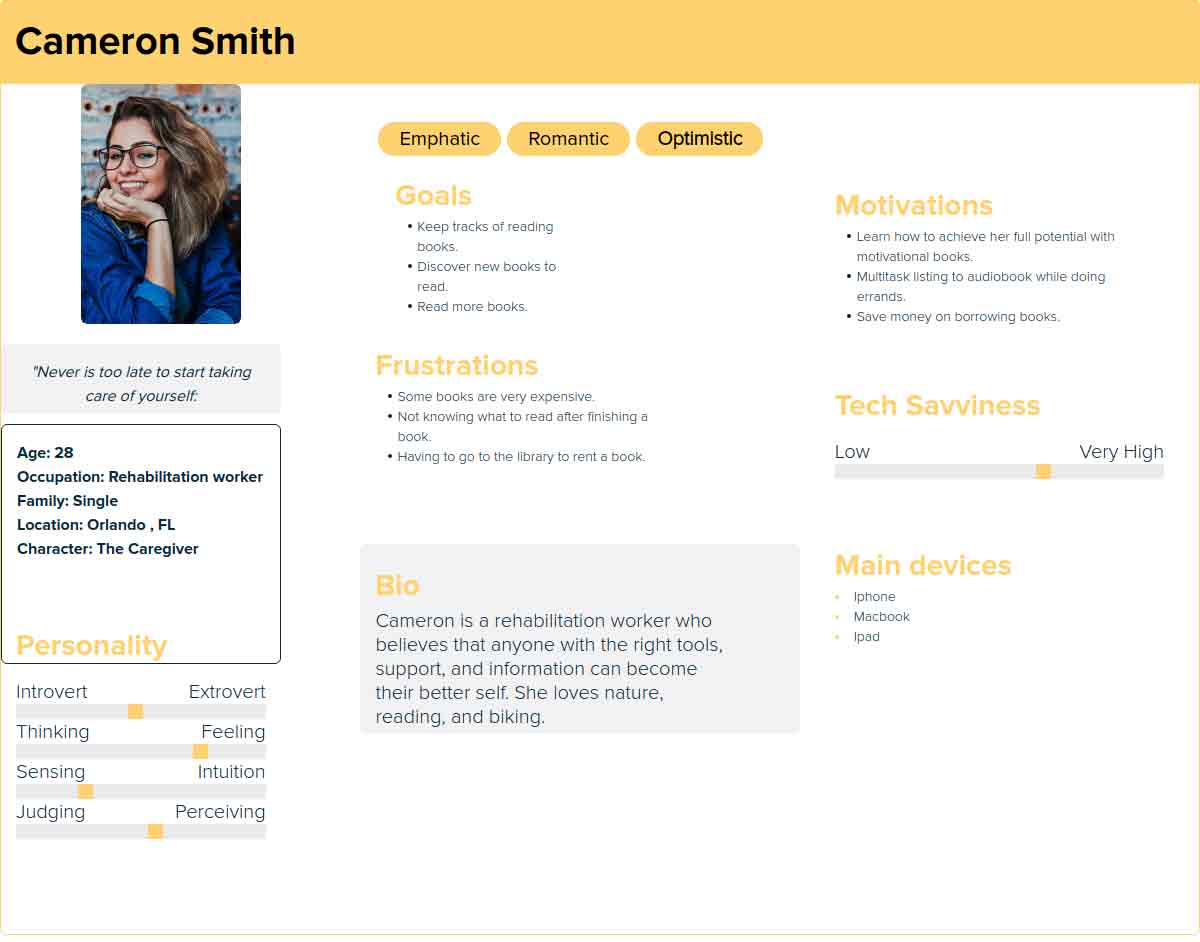
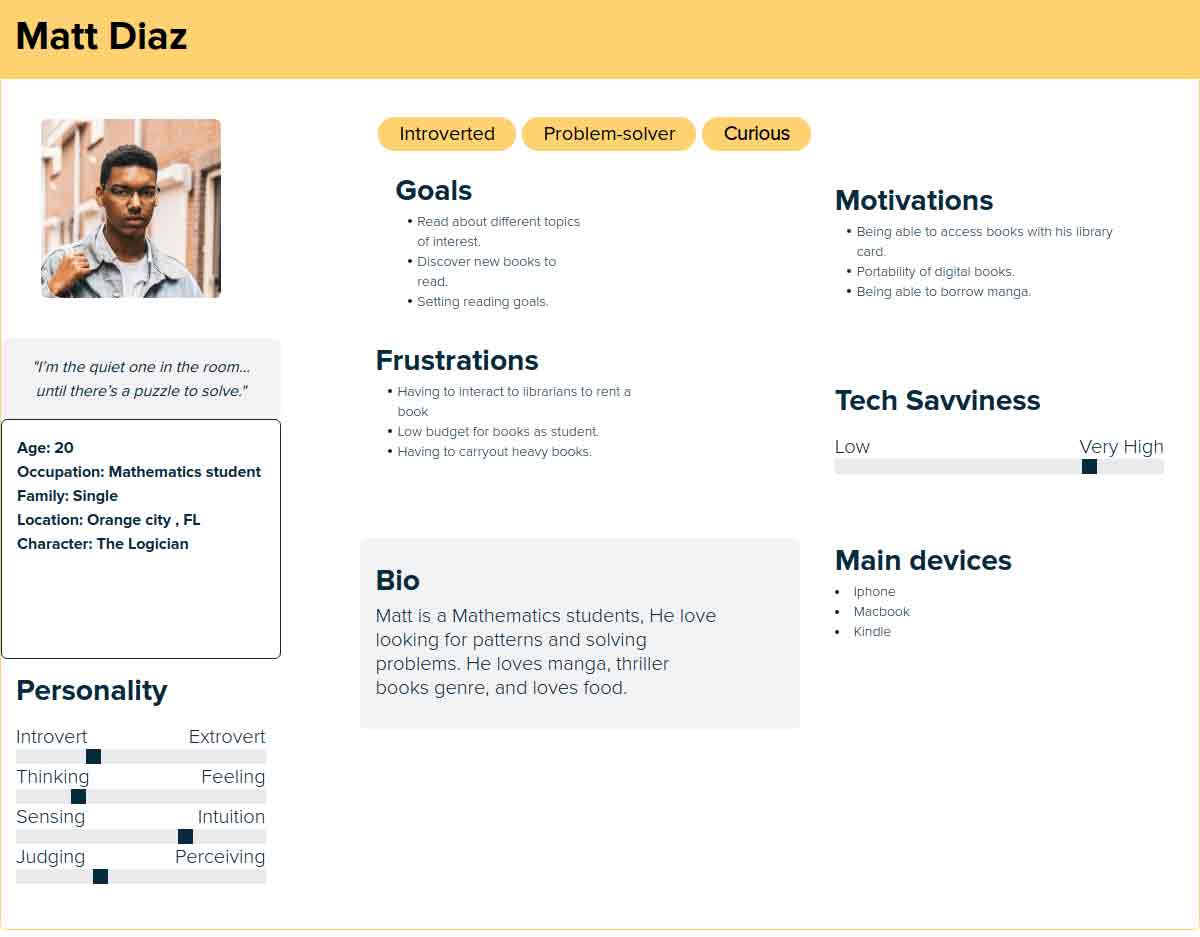
Gen-Z and millennials between 17-34 years old, who are in high school, college, or in the work field who enjoy reading, who are online through a smartphone, and possess a library membership.
Design and Creative Objectives

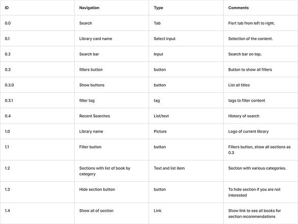
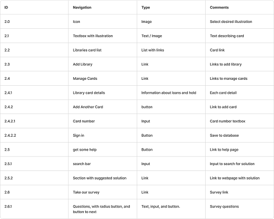
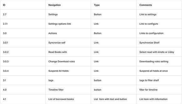
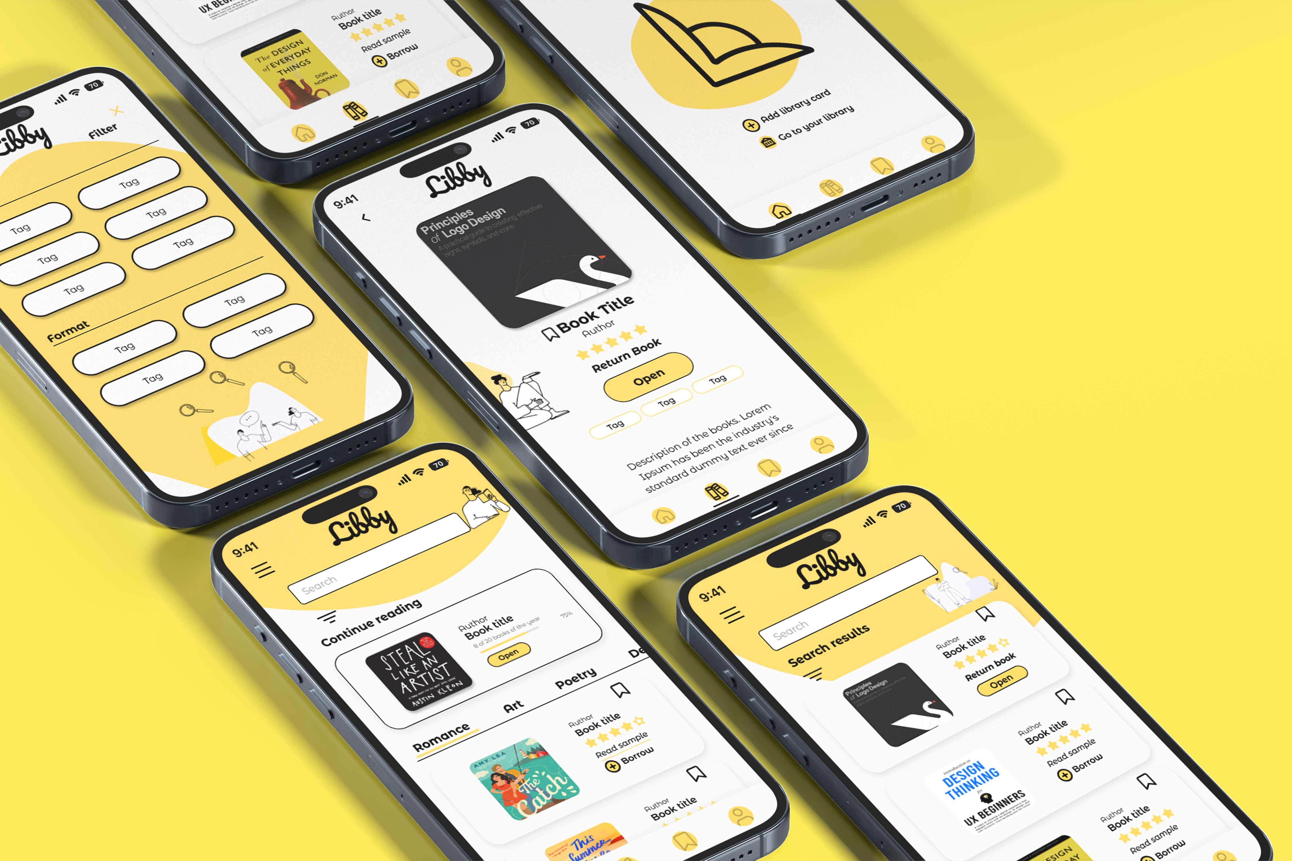

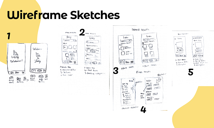
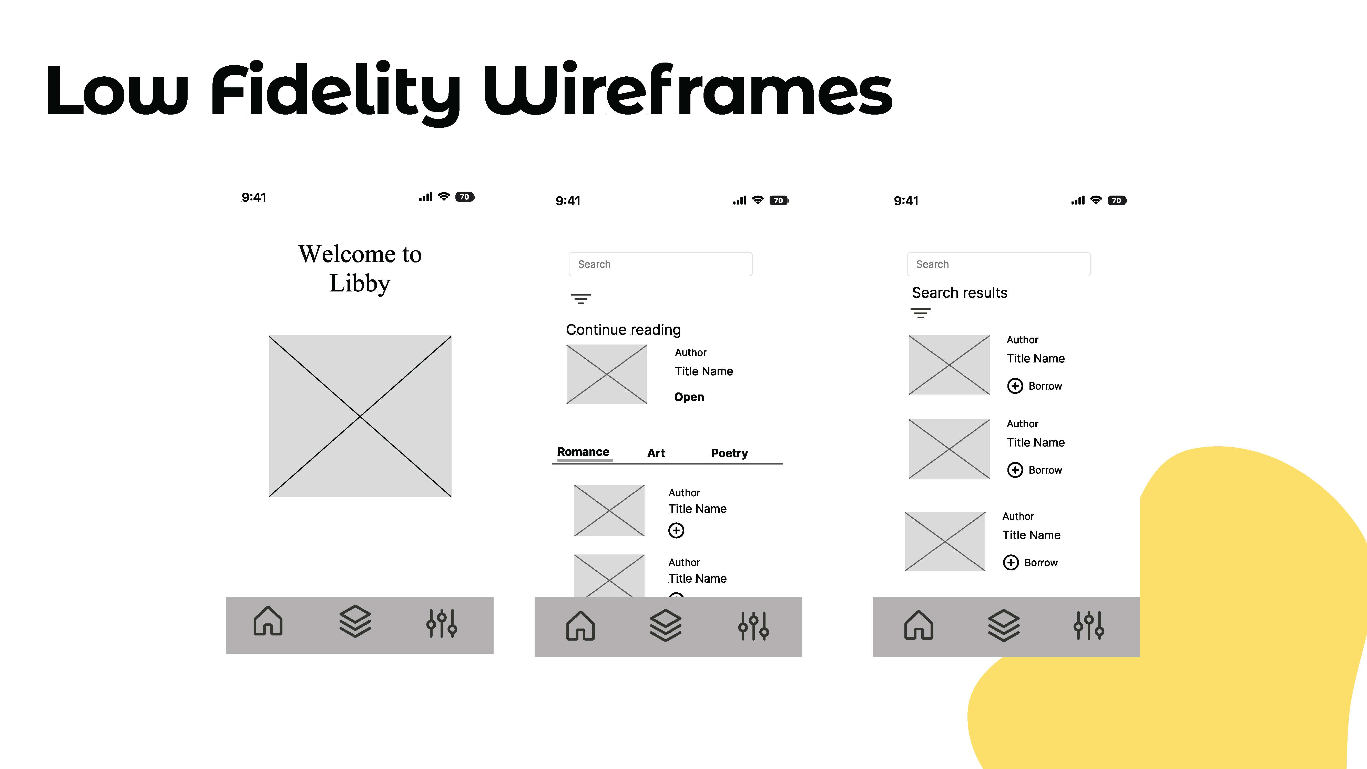
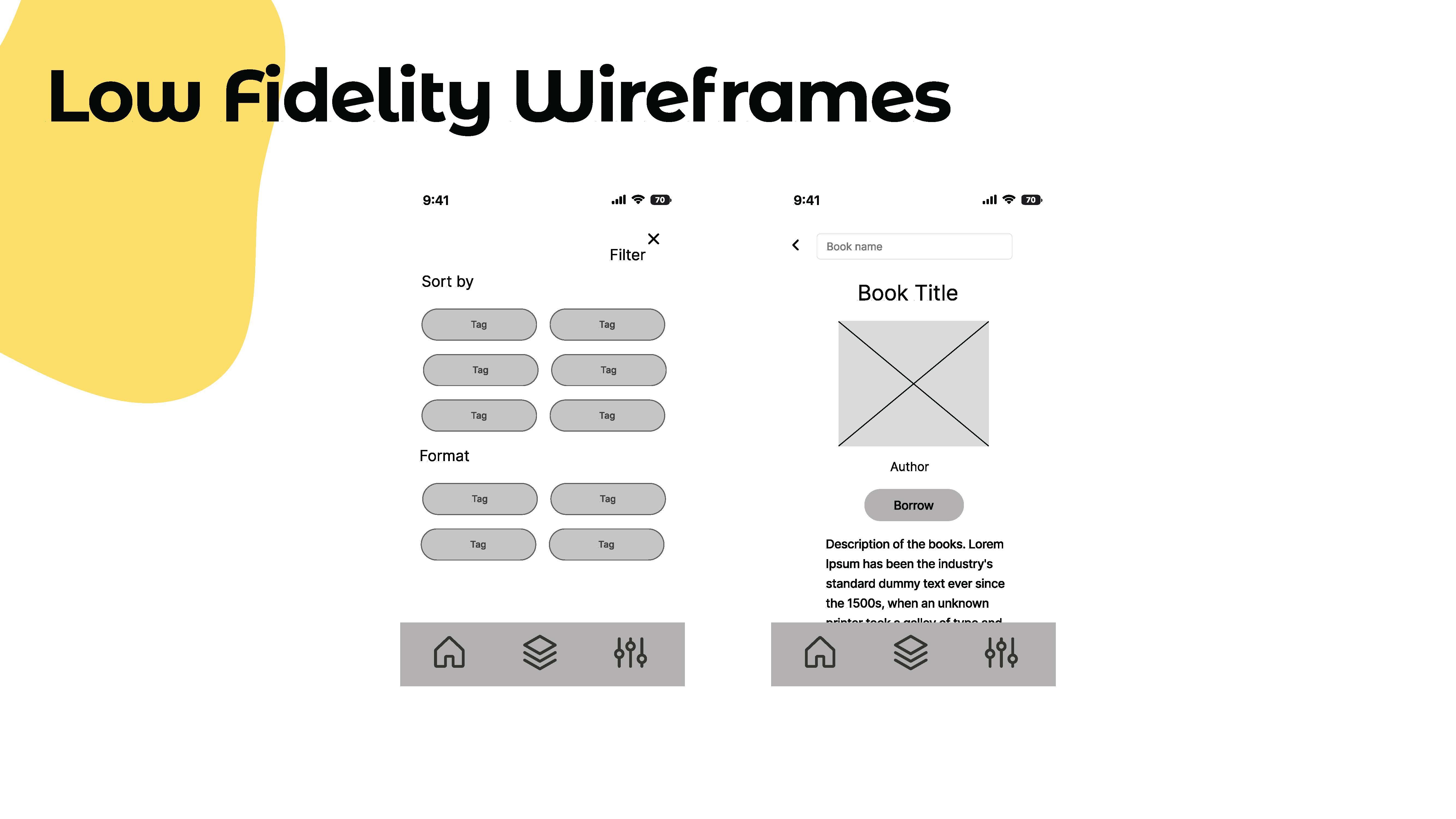
The test was moderated in person. I sat beside the participants and asked them to complete the tasks mentioned below. Two of the users are part of the target audience, and one can be a user because is a reading app but not especially part of the target audience.
I had three users went through these tasks:
User 1
Name: Ronnay Tavera
Age: 23
Profession: Engineer
He says that everything was easy, and was intuitive. His only suggestion was to make the go to Library link more visible.
My observations: He went directly to the icons to realize the tasks, and didn’t spend too much time in reading the text of links.
User 2
Name: Gabriela Tavera
Age: 13
Profession: Student
She also found it very easy, and recognize the libby app. Her suggestion was to make the return book link more visible. She couldn’t understand how I communicate the filter task.
My observations: She was the fastest of the three users, she knew right away where to go to see the book details.
User 3
Name: Oscar Tavera
Age: 55
Profession: Pastor
He liked the app, and He was able to accomplish all tasks. He suggested adding an action button to the search bar.
My observations: He was the one who took more time to accomplish some tasks, but he was able to accomplish all of them, He took his time to read the labels and to test some icons to accomplish the task.